Displacing the privileged vs squeezing the middle: a bit more evidence
The discussion in Scotland about widening access to university remains dominated by the idea that any “displacement” will be a problem mainly (or even only) for the most advantaged. As the journalist Kevin McKenna put it this weekend (“Scottish Higher Education Should be for all, not the gilded few”):
Conservatives have their own weasel word for this process; they call it “displacement”. What they really mean is that the privileges affluent children have enjoyed for centuries may be put at risk by giving privileges to poorer children. We will hear more people talking about “displacement” in the next few weeks as we begin to digest figures released last week by Ucas, the university admissions body…..
As university places for Scottish students are capped as a result of the SNP and Labour’s successive policies of free tuition, it means that, inevitably, there will be a squeeze on places going to middle-class students if more poor children gain access. ….
There are vast, sprawling neighbourhoods in Scotland’s major cities where children, no matter how bright they may be, will rarely have the opportunity to make the most of their academic abilities by attending our top universities.
Within a few miles of these places there are more arboreal districts where children enjoy an eye-watering assortment of advantages in the race for university places. These range from hours of expensive private home tuition to flat financial inducements for every higher A pass gained…..
Thus, our universities are diminished by choosing from a very narrow gene pool. Their lecture theatres are not filled with the brightest and the best, just the brightest and the best of a narrow social stratum.
McKenna is right that the UCAS data is worth careful attention for what it shows about changing patterns of participation. That’s what this post looks at.
Not everyone is either very rich or very poor
The data reminds us that between McKenna’s “vast sprawling neighbourhoods” and “arboreal districts” are a lot of places which are neither acutely deprived nor especially privileged. It adds to the evidence that it is the people from these in-between places, rather than the more arboreal ones, whose access to higher education is now under most pressure. It turns out, quite predictably and no doubt for all the reasons that McKenna’s article identifies, that those at the very top are proving to be resilient occupiers of university places.
What the UCAS data does
The latest UCAS data release includes an“experimental data explorer” which enables anyone to graph trends in a variety of factors relevant to equality in university access. Setting the parameters to Scottish institutions and SIMD provides data just on Scottish-domiciled students at Scottish universities. It tells a story of dramatic change, due to policy intervention.
Offer rates
The offer rate is the proportion of applications made from a particular group which resulted in an offer from a university.
Here it is for Scottish 18 year olds, applying to Scottish universities.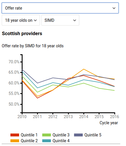
This shows that in 2013, applications from SIMD 1 and 2 (the 40% most disadvantaged areas) went from having the lowest offer rates to doing as well as those from SIMD 5 (the least disadvantaged 20%). In 2014, this continued, so much so that SIMD 2 applications had the highest offer rate of any group. In 2015 and 2016, their offer rates fell back, as these did across the board, but remained as high as for those in SIMD 5 and SIMD 4.
SIMD 5 offer rates have held up pretty well over the same period: they are still as high as they were in 2012. Much the same is true for SIMD 4, though there are signs of a slightly sharper drop in the past year: they are now a little below their 2012 level.
It is applications from SIMD 3 areas – the 20% in the middle – which now sit at the bottom of the table, and have seen the clearest decline over the period.
Actual vs expected offers rates
Behind this, UCAS provides an even more revealing graph. This considers how the actual offer rate for a particular group compares with what would have been expected from the overall level of offers that year, based simply on candidates’ grades and choices of course. As I recall, this statistic was first produced in response to the concern that some ethnic minority groups were getting fewer offers than their grades and choices would have predicted. It therefore functions as a rough measure of how far the system favours, or not, certain groups.
The first chart below shows what UCAS calculates the average offer rate would have been in theory in each SIMD quintile, just based on grades and courses applied for. It shows that the likelihood of getting an offer would be expected to decrease as disadvantage rose, reflecting decreasing exam scores.

The graph below shows how the actual offer rate (the figures in the very first graph shown above) depart from this. A positive score shows that a group has done better than their grades and course choices would predict
For Scottish 18 year-olds by SIMD, it looks like this.

This is a powerful image of positive discrimination. From 2013, it shows SIMD 1 and 2 applications becoming much more likely to receive an offer, despite lower results. By 2014, they see the largest positive benefit of any applicants.
This doesn’t mean there was displacement by SIMD 1 or 2 entrants during this period. The improvement for SIMD 1 and 2 was due to the release of additional places ring-fenced for widening access from 2013-14 onwards. As these charts show, this meant in practice a concentrated effort on applicants from SIMD 1 and 2. To fill these extra places, universities clearly dropped their entry requirements for these applicants, but not for others, and this produces the graph above. The UCAS site makes it easy to look at the pattern for individual institutions, and this confirms that this effect is due to changes in the data for those universities which received the extra places (see here). You’ll rarely see the impact of a specific policy intervention illustrated so unambiguously.
The falling lines for SIMD 3 and SIMD 4 show that ordinarily these groups would be expected to benefit from a fall in the average entry requirements, because they include a fair number of people with less strong results. But in this case, they didn’t, as these lower entry requirements were limited to more disadvantaged groups. But the larger issue for these groups has been the absence of any growth in places more generally, as general demand has risen. SIMD 3 in particular are the only group to have started and ended the period less likely to receive an offer than expected.
SIMD 5 meantime turn out to have had a historic advantage in terms of higher-than-expected offer rates, which has fallen since 2012 but persists (in contrast to SIMD 4). Life is not much disturbed in McKenna’s arboreal districts. They are a resilient group, due to a combination of stronger exam results and – this graph suggests – some additional advantage they enjoy in obtaining offers (which could be something as simple as getting better advice on the tactics of applications).
Looking ahead
Further extra places are not promised (there was some controversy a year ago over the future of the targeted places scheme).
From here on, it seems more likely that any growth in participation by those from disadvantaged areas will involve constraining admissions from another. From the graphs above, who looks most vulnerable?
The latest UCAS statistics suggest that far from there being a single homogenous “advantaged” group, serious advantage is more resilient than the moderate form.
To loosen the grip of the most privileged on the university system, to “displace” them, would almost certainly require policies as focussed on that group, as recent policies have been on SIMD 1 or 2: limits on the numbers who can be recruited, financial penalties on universities for over-recruitment, substantial financial incentives for such students to go elsewhere (to do the apprenticeships increasingly promoted as equaivalent to degrees, for example). Without such policies, which it’s hard to see any politician enacting, a government might be a champion of the poor, but it is unlikely to disturb the wealthiest much.
The assumption made by Kevin McKenna, and others, still too often seems to be that in a system that isn’t growing, adding more people from very disadvantaged backgrounds will some how force out those from the opposite end – like a single strike on a Newton’s cradle. But that doesn’t take into account how effectively serious socio-economic advantage defends itself. The UCAS data here suggests we should imagine something more like a pouch of liquid in a vice. There will be one group protected by government intervention (rightly) and another by their families, squeezing a less well-protected group. This will typically contain first or second generation students from modestly-funded state schools with average catchments, perhaps limited family knowledge of HE, capable but not clutching straight As. It would be ironic if people concerned about social justice were so transfixed by the idea of getting one over the rich, that they failed to notice it was these people who face the greatest squeeze.
Footnote 1: Offers are only part of the story
This data is dramatic, but is only one part of the story that gets someone into university. Offers can be rejected, exams not yet sat can disappoint (although in Scotland, more offers have traditionally been based on existing Highers results), people can change their mind just at the point they are due to start. The offer rate is however worth examining in isolation because it is the part of the system which most directly reflects decisions at university level. The data explorer does also provide information on placed applicants per 10,000 population by SIMD, but this is affected by variations in the application rate in each group over time.
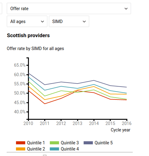
Footnote 2: All-age data
For those at all ages, UCAS only provides data on the offer rate (the first graph above). That shows less dramatic change once older applicants are included, implying that for applicants through UCAS, the policy intervention was concentrated on school leavers. This data will include some of those who started at college on an HN-level course, and then moved to university. However, only some of these cases will go through UCAS. Including this group might well alter the picture again, as a number of the ring-fenced access places were for articulating students.
Footnote 3: Are there alternatives to funding more places?
This piece for The Herald discusses in more detail what other safety valves there are in the system. One ought to be a temporary fall in the number of 18 year olds, although that is not having as much effect as might be expected. The most substantial change would be EU/EEA students ceasing to be entitled to SG-funded places, post-Brexit.


Comments are closed.