A picture of education inequality
Here, thanks to the underlying data provided as part of last week’s new version of SIMD, is one picture of what education inequality looks like in modern Scotland.
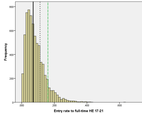
The graph above takes the 6,976 small areas (“datazones”) into which Scotland is divided to calculate SIMD scores, but looks only at the single indicator which measures the proportion of all those aged 17 to 21 in each datazone who started in full-time degree-level study. The figures are available for all but three datazones.
The data used are available here (under “indicator data”) and cover the period 2012/13 to 2014/15. The full description of the indicator is at page 48 here.
Interestingly the SG explains that “study at degree level has been chosen as this level provides the highest gains in future earning potential and reduces double counting of students that progress from HND to degree”. This means that in its own measure of disadvantage, the SG chooses to exclude college-level HE (which it often elides with university-level study) not just on technical grounds, but also on grounds of lack of equivalence. Worth noting in passing.
What does this graph tell us? Most obviously, that the position is generally skewed towards lower levels of entry.
The thick black vertical line marks the median value – that is, the mid-point of the distribution, where one-half of areas are to the left, and the other half to the right. It has a value of 7% (0.07/1). The dotted line marks the point at which three-quarters of all areas are to the left, and just one-quarter are to the right: its value is 11.3%. At the green line, just one-in-ten areas are to the right: it has a value of 16%.
So this graph shows how unequally distributed early, direct entry to university in Scotland remains by area (it tells us nothing about individuals’ circumstances). The 10% of areas with the highest values sit between 16% and 43% (excluding an outlier at 63%). Meanwhile, half the country lies at 7% or below, and three-quarters is below 11.3%. The bottom quarter (not marked) all lie at 4% or below.
You could argue, rightly, that chopping up Scotland along different lines, or using a smaller number of larger areas, would produce a slightly different result (using larger areas ought to reduce the number with very low or high results, for example). But the broad picture? It wouldn’t change much.
Yesterday the Scottish Government confirmed in its Plan for Scotland that:
We have set the Government and our universities, along with the wider education system, the challenge of ensuring that by 2030, 20% of university entrants are drawn from the 20% most deprived communities.
This graph is one illustration of quite how big a challenge that represents.
How far “deprived communities” as measured by SIMD as a whole map on to those with the lowest direct young entry rates to university can also be worked out from this data – a post on that may follow.
Technical note


Comments are closed.